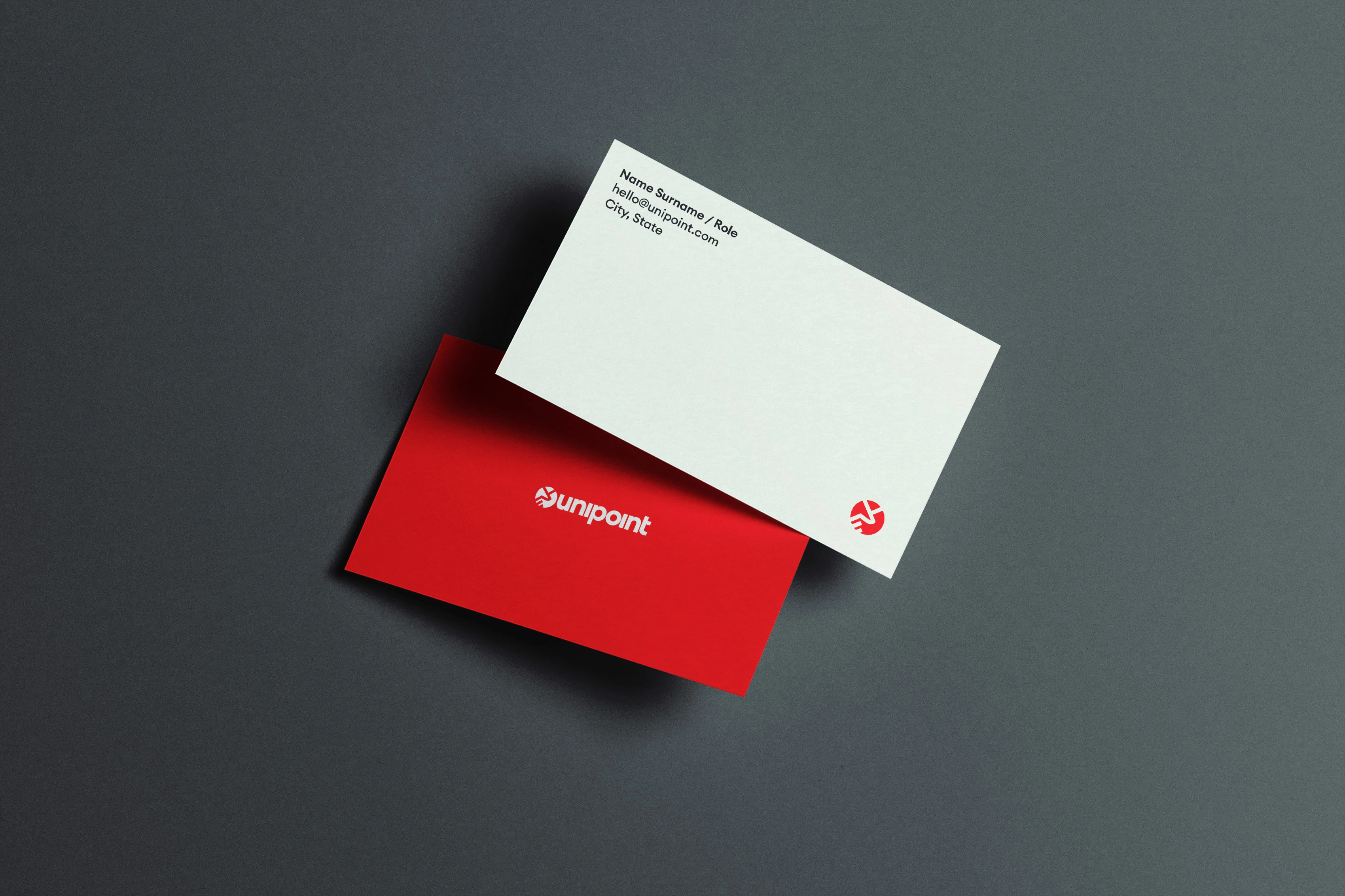
Unipoint
Logo, visual identity, guidelines and stationery
A coherent brand, down to the details
Unipoint handles managed IT, security, and software support for small and mid-sized businesses. Because the work sits underneath everything a client does, the identity needed to read as a dependable, structured partner.
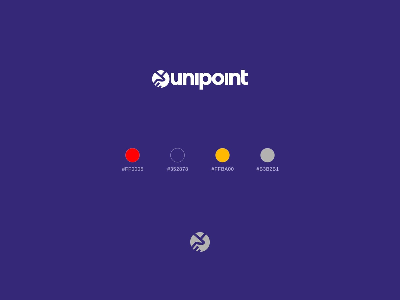
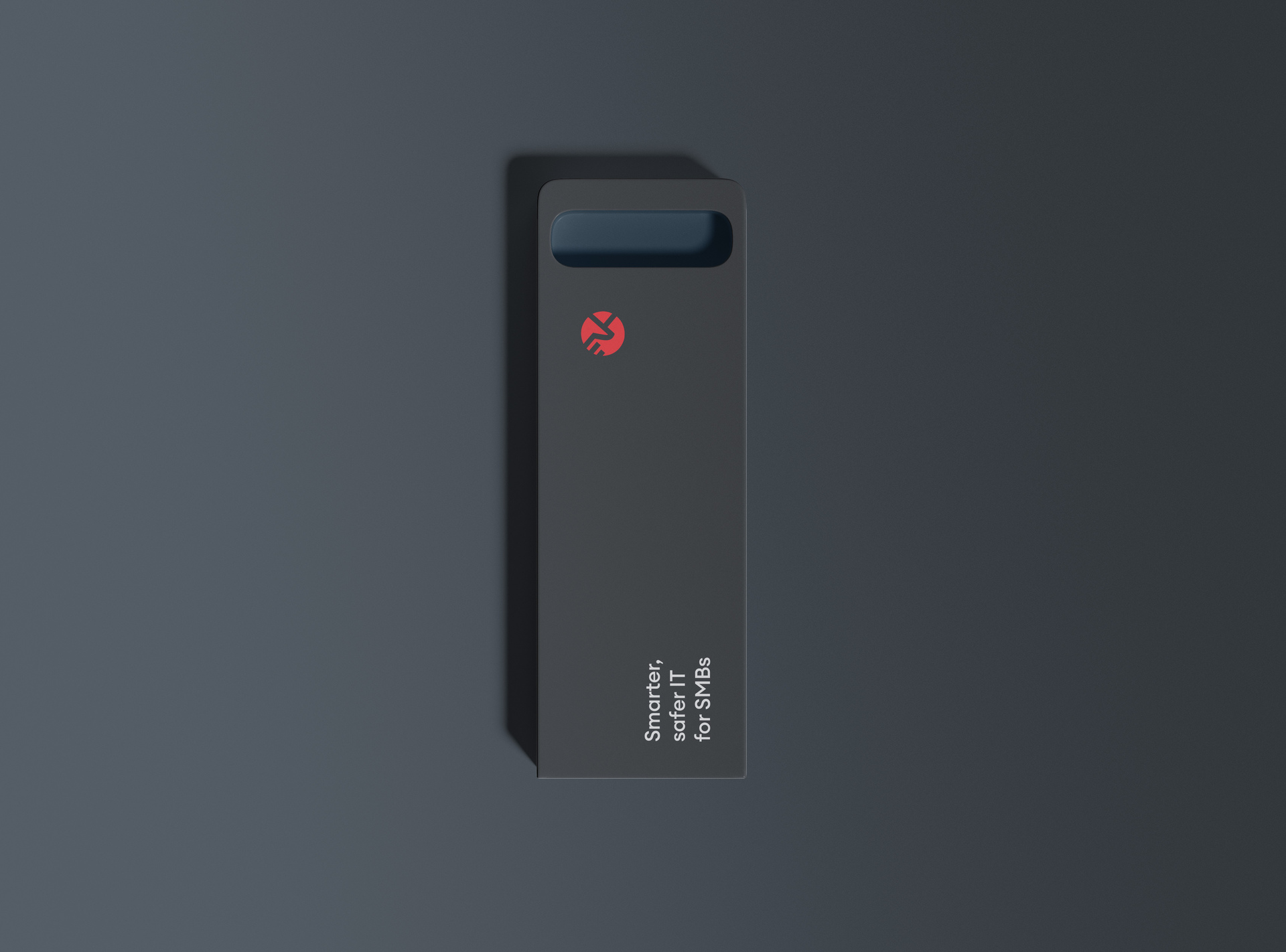
The Handshake Circle anchors it: two hands interlocked in a ring, balancing technical oversight with collaboration. Euclid Circular A and Lato carry the type, alongside signal red, Picotee Blue, and neutral grey.
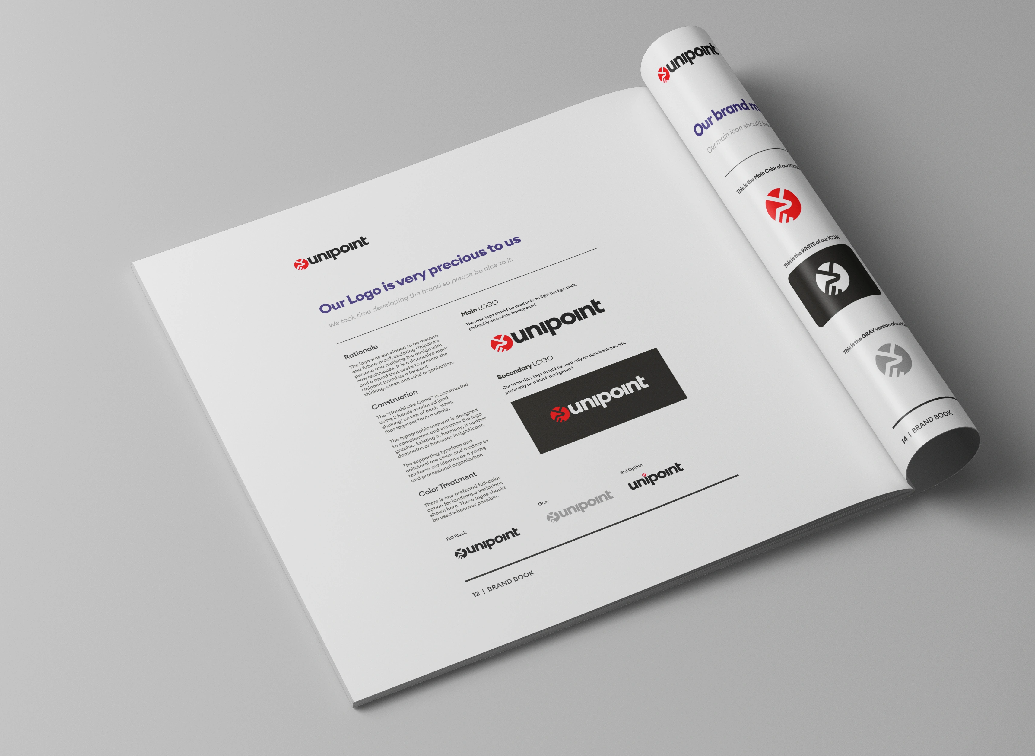
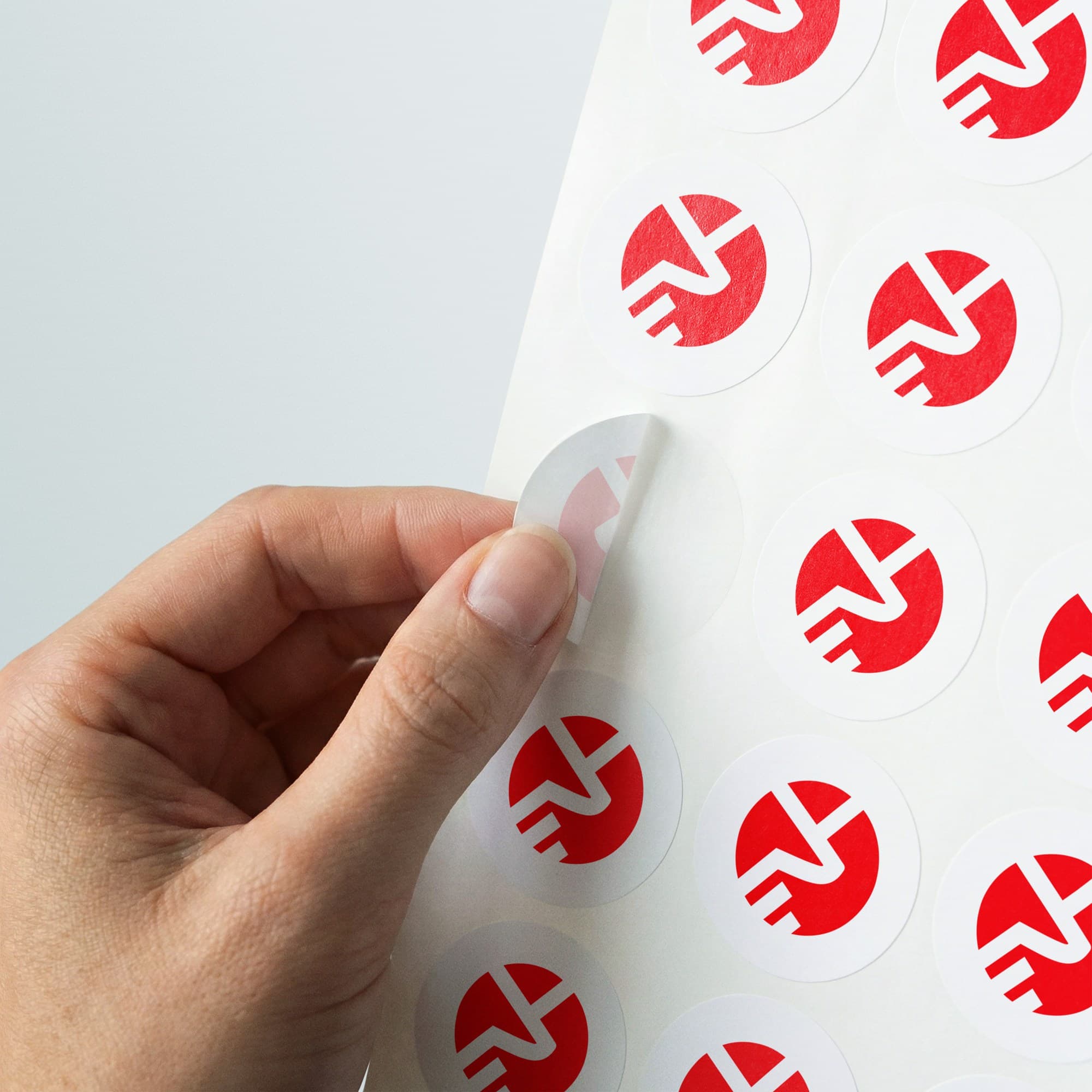
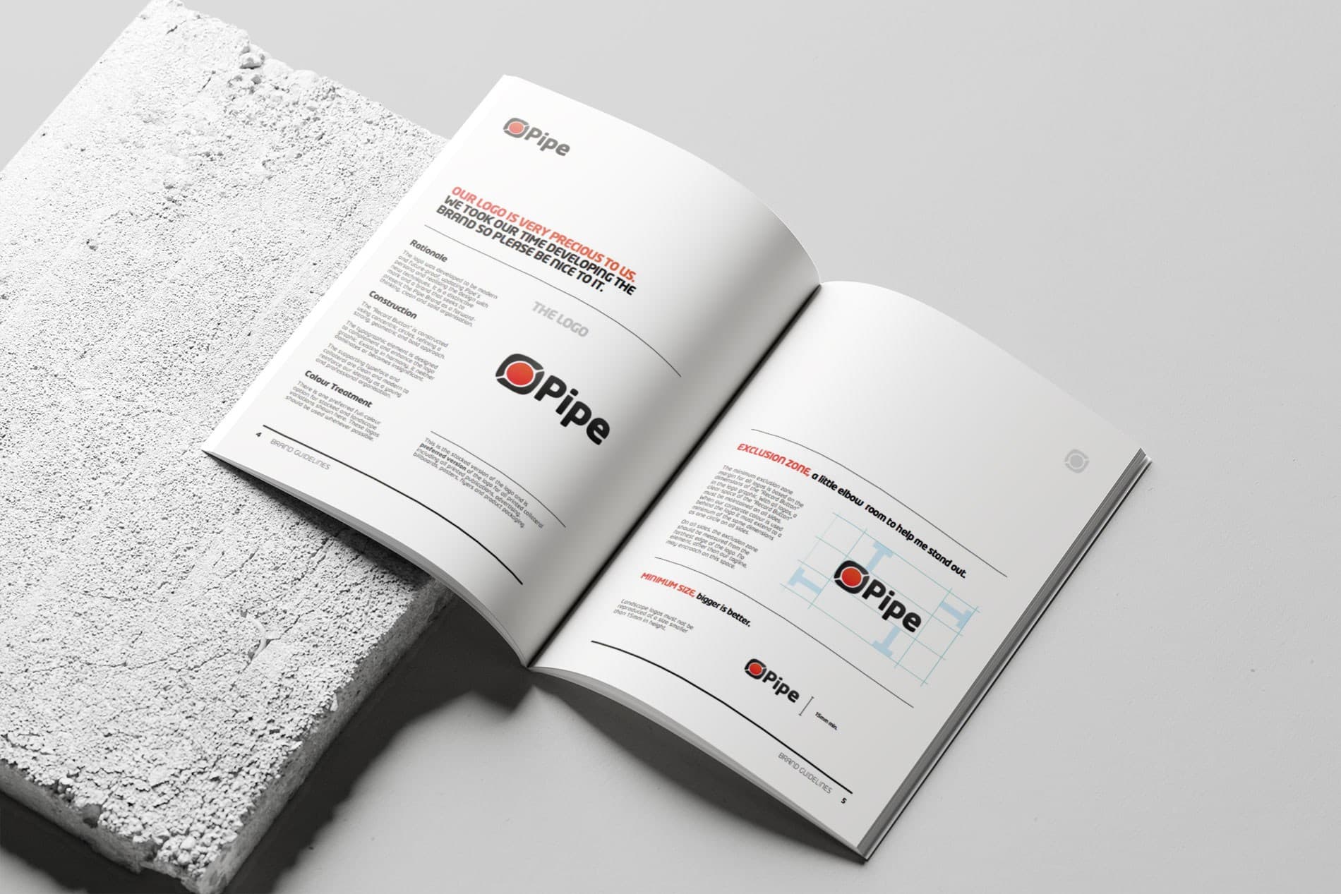
Guidelines set spacing, dark-surface lockups, and photo direction, so the identity holds together across stationery, hardware, labels, and screens.
Select projects
Tell me what you're building and where the brand needs to show up next. We'll start with what you need.
Email me