Managemate
Logo and visual identity
A mark that works beyond the screen
Managemate connects condominium boards and property managers in Ontario. Two audiences, one tool: the identity had to feel structured enough for professional managers and intuitive enough for volunteer board members.
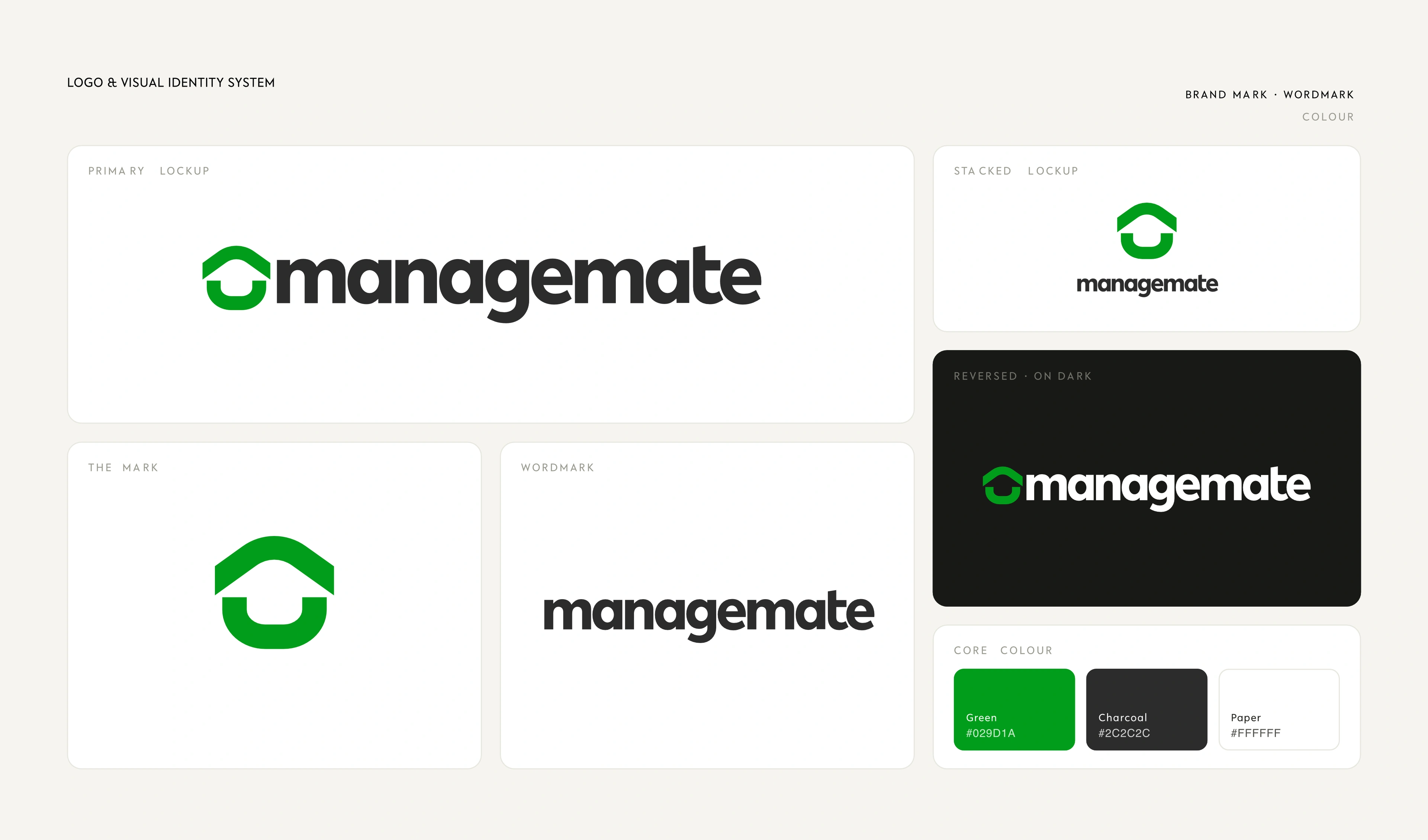
I designed the symbol, wordmark, and green identity system to convey reliability without corporate stiffness. Symmetrical geometric shapes link together to suggest shared workflow, which keeps an operations tool feeling simple.
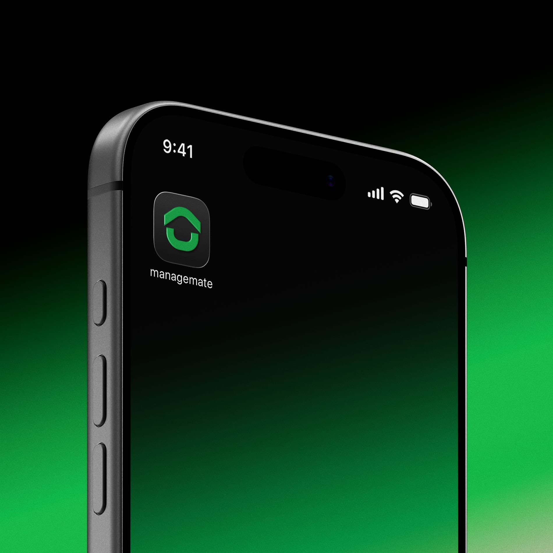

The mark stays clear at small scale as a mobile app icon, and extends across web interfaces, business cards, lanyards, and signage.
Select projects

Tell me what you're building and where the brand needs to show up next. We'll start with what you need.
Email me